BRANDING
July 1, 2026 · 2 min read
Why Your Brand Looks Different Everywhere
Inconsistent logos, colours, and tone across your website, social media, and invoices quietly erode trust. Here's how to fix it without a rebrand.
READ ARTICLEMore than half of web traffic comes from phones. If your site only works well on a laptop, you're designing for a world that no longer exists.
Pull out your phone and visit your own website. Not the desktop preview in your website builder, the actual live site, on a real device, with your thumb. Can you read the text without pinching? Can you tap the buttons without misclicking? Can you find your phone number in under ten seconds?
For most businesses, the majority of website visits now happen on mobile. Yet countless sites are still designed on large monitors, tested on Wi-Fi, and launched without a single real-world phone test. The result is frustrated visitors who assume you don't care.
Mobile-first design doesn't mean shrinking a desktop layout until it fits. It means starting with the smallest screen and the most distracted user, then expanding thoughtfully for larger displays. Navigation that's obvious on a 27-inch monitor can be impossible on a phone if menus are hidden behind tiny icons or buried three taps deep.
KEY INSIGHT
Google predominantly uses the mobile version of your site for indexing and ranking. A poor mobile experience can hurt your visibility everywhere, not just on phones.
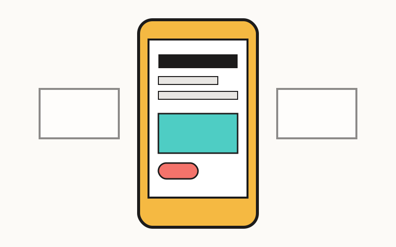
Think about how you hold your phone. Your thumb reaches the bottom and middle of the screen more easily than the top corners. Primary actions (call, contact, buy, book) should live where thumbs naturally rest. Secondary information can live higher up or behind clear menu structures.
Browser emulators are useful, but they miss the friction of real life: cracked screens, bright sunlight, one-handed scrolling on a moving bus. Hand your phone to a colleague or friend and watch them try to complete a simple task on your site: find your address, submit a contact form, browse your services. Don't help. Just observe.
PRACTICAL TIP
If you do one thing this week: make your phone number and email tap-to-call and tap-to-email links. It's a five-minute fix that removes friction for ready-to-buy visitors.
July 1, 2026 · 2 min read
Inconsistent logos, colours, and tone across your website, social media, and invoices quietly erode trust. Here's how to fix it without a rebrand.
READ ARTICLE
June 28, 2026 · 2 min read
If you or your team repeat the same steps every week, you're probably wasting hours that automation could give back. Here's where to start.
READ ARTICLESometimes a short conversation is worth more than a dozen articles. We're here when you're ready.